Informed, easy insurance aggregation made easy with Azki
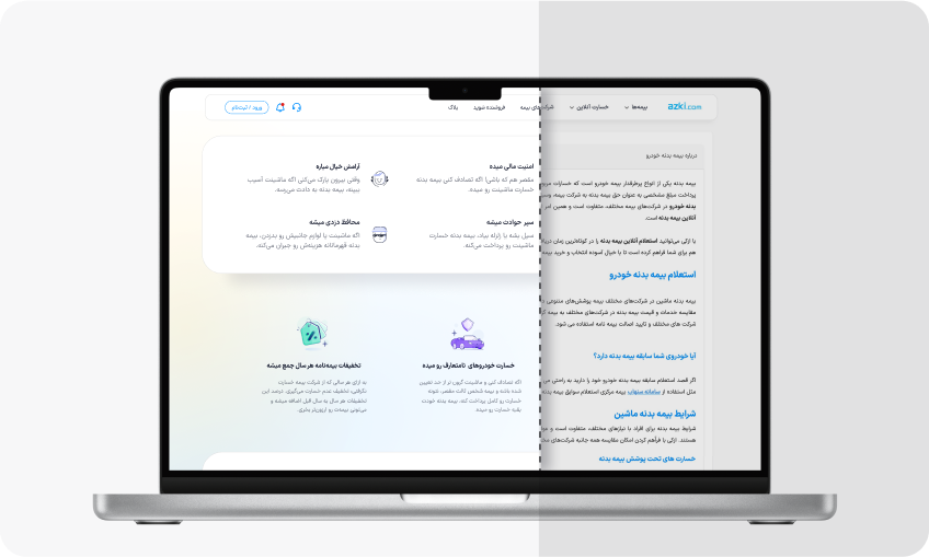
Redesigning for Visibility, Clarity and Consistency
Azki had recently redesigned the homepage and developed a design system.
As a fast-growing company, Azki is becoming the top online insurance platform in both SEO and User Experience.
To create a seamless experience with optimized content structure and keywords, we redesigned the Car Insurance Landing Page, one of the main products.
🔥Impact
This redesign improved user engagement, with time on page increasing by 63% and average scroll depth rising 18%.
My Role
I took the initiative to improve information architecture and ensure user interface consistency and scalability. My contributions included identifying issues through user research, defining problem scopes, designing solutions and conducting tests.
🤝 In collaboration with:
- The SEO team to develop a data-driven, optimized content structure together.
- UX writer and visual designer to ensure consistency and clarity in all elements and content.
- Front-end developers to create smooth transitions and micro-animations.
Key challenges
Addressing Clutter, Inconsistency and Limited Visibility
- The landing page was visually cluttered and hard to read and navigate.
- The design was not aligned with the design language and needed updates for consistency.
- Essential details about the insurance process and regulations were often overlooked, even though they were explained on the page.
- SEO performance was weak, limiting its reach to potential users.
I saw an opportunity to improve content flow, making it more accessible for users to find their answer. This redesign had a chance to empower users with information, reducing support requests and lowering operational costs.
A Closer Look at the Design Process

Auditing Content
To understand current structure and content, I audited the existing landing page:
Analyze Feedback
Audit Page
List Needed Content
By analyzing calls and online chat logs, I spotted the most frequent user questions.
I Identified what information was missing or outdated, as some details needed update.
I listed all content that need to be included based on users needs and challenges.

Metrics That Mattered
Together with the product manager, we analyzed several key metrics to understand how users were interacting with the existing landing page.
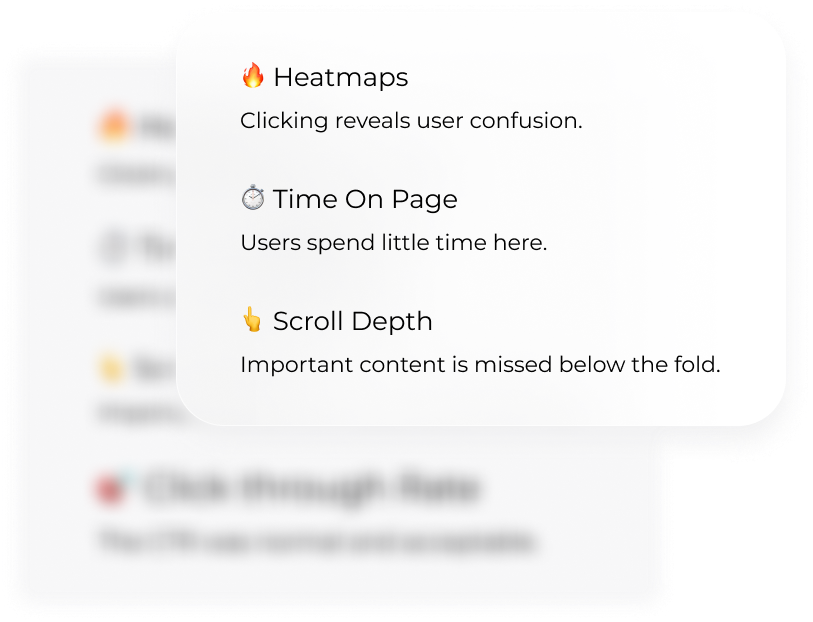
By analyzing key metrics like time on page, scroll depth, and heat maps, we figured users skimmed through the page without fully reading the content
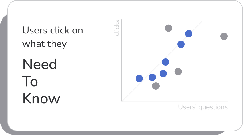
Heat maps revealed that there were excessive clicks on certain keywords and phrases.
Interestingly, these phrases aligned closely with the questions users asked the call center.

Strategic Content Through Storytelling
I collaborated with the SEO team to refine the content based on search optimization insights, to make sure it was both informative and SEO-aligned.
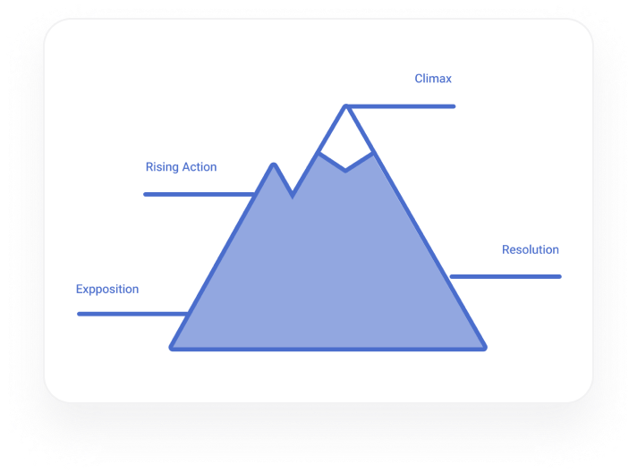
I grouped information according to the storytelling approach. This structure helped users learn about car insurance by guiding them through key points:
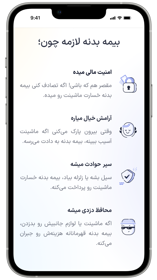
- Create attention by mentioning benefits of car insurance
- Showing why they should trust Azki.
- How Azki’s services could help.

Wireframe Testing: Finding the Focus Areas
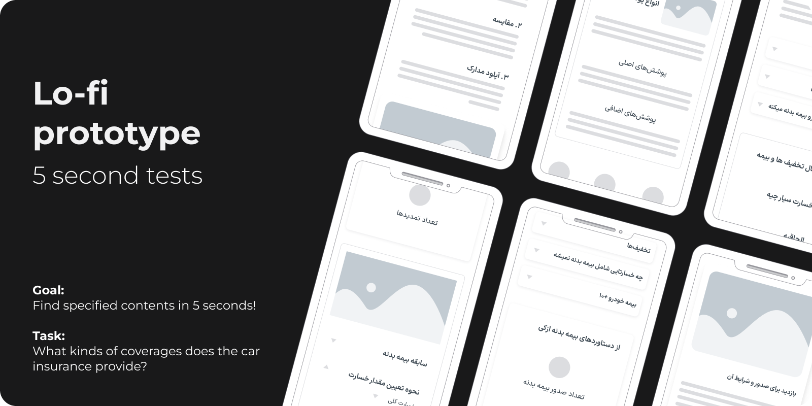
I needed to make sure users could easily find and use the content. To make it quick and efficient, I ran a few five-second and down-the-hall tests using low fidelity wireframes.
💡
The tests results helped me pinpoint the areas which needed more visual emphasis in order to get enough attention.
With the feedback from the tests, I used visual elements to highlight key sections in the high fidelity design. Then, we discussed the implementation and optimization of the design with the frontend developer team.
We limited micro-animations to maintain page speed while preserving the design’s informative nature. ensuring it aligned with development standards.
Finally, by removing some animations without impacting the design’s informative nature, the final design was developed in its optimized form. This trade-off was crucial to achieve better overall results.
Design Decisions
🔑 Consistency is the key
To maintain visual coherence and keep development costs down, I used components created initially for home page.
🕵️♀️ Polishing the Details
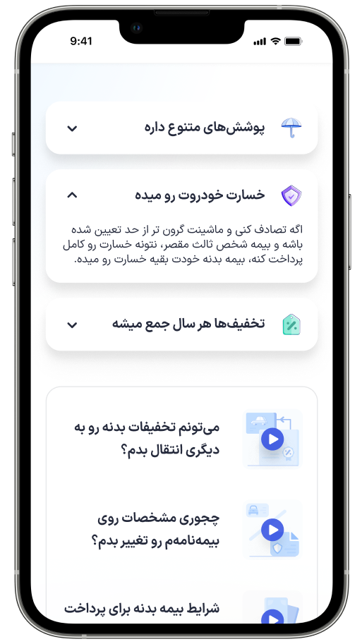
Some components needed more refinement. like video covers which didn’t seem clickable and USPs attracted too much attention.
👌 Fitting Just Right
I updated components to meet the landing page’s specific needs, to ensure they looked and functioned as expected.
The final version was shaped by input from the product, design, technical and SEO teams, as well as user feedback.

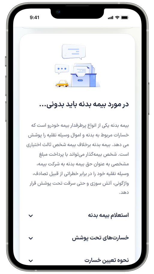
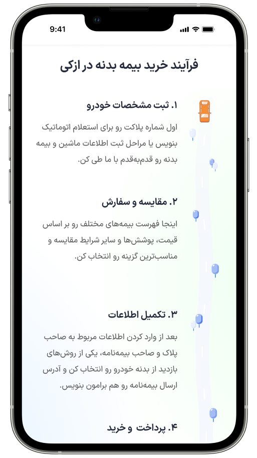
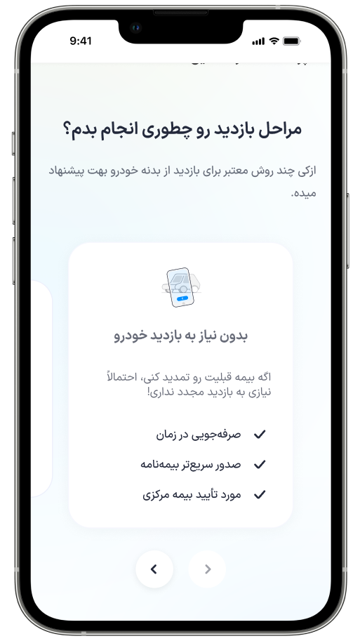
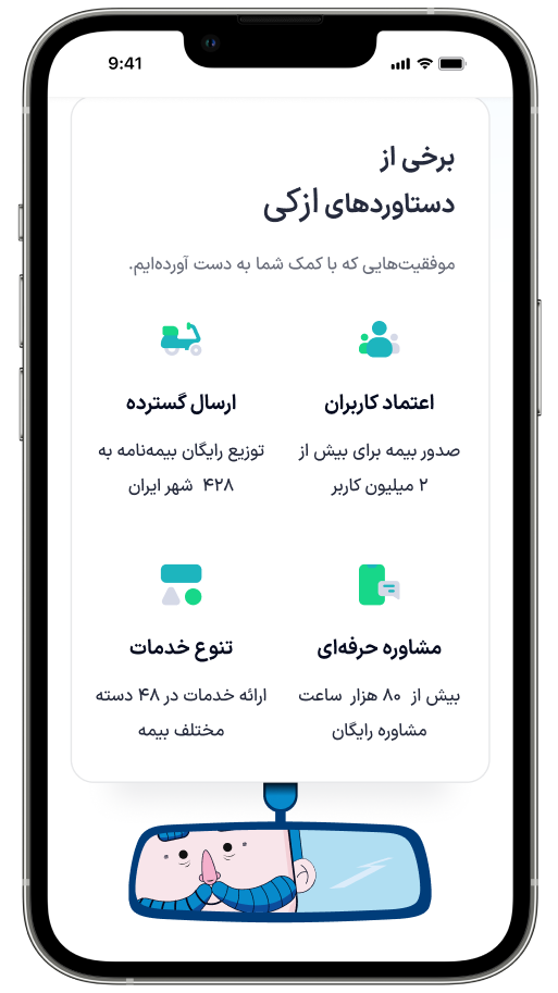
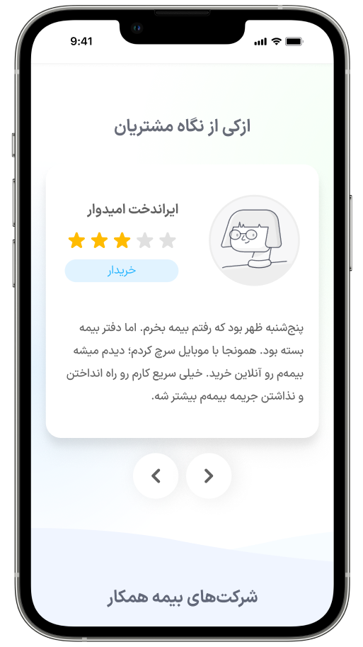
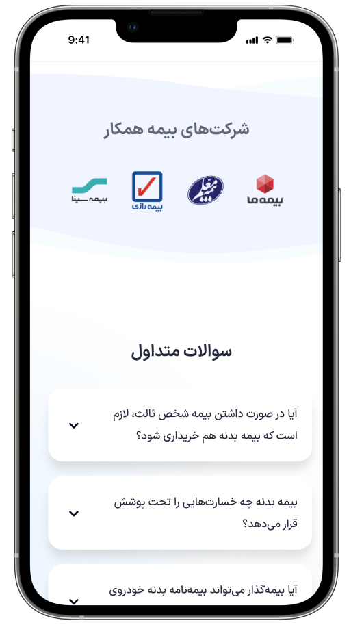
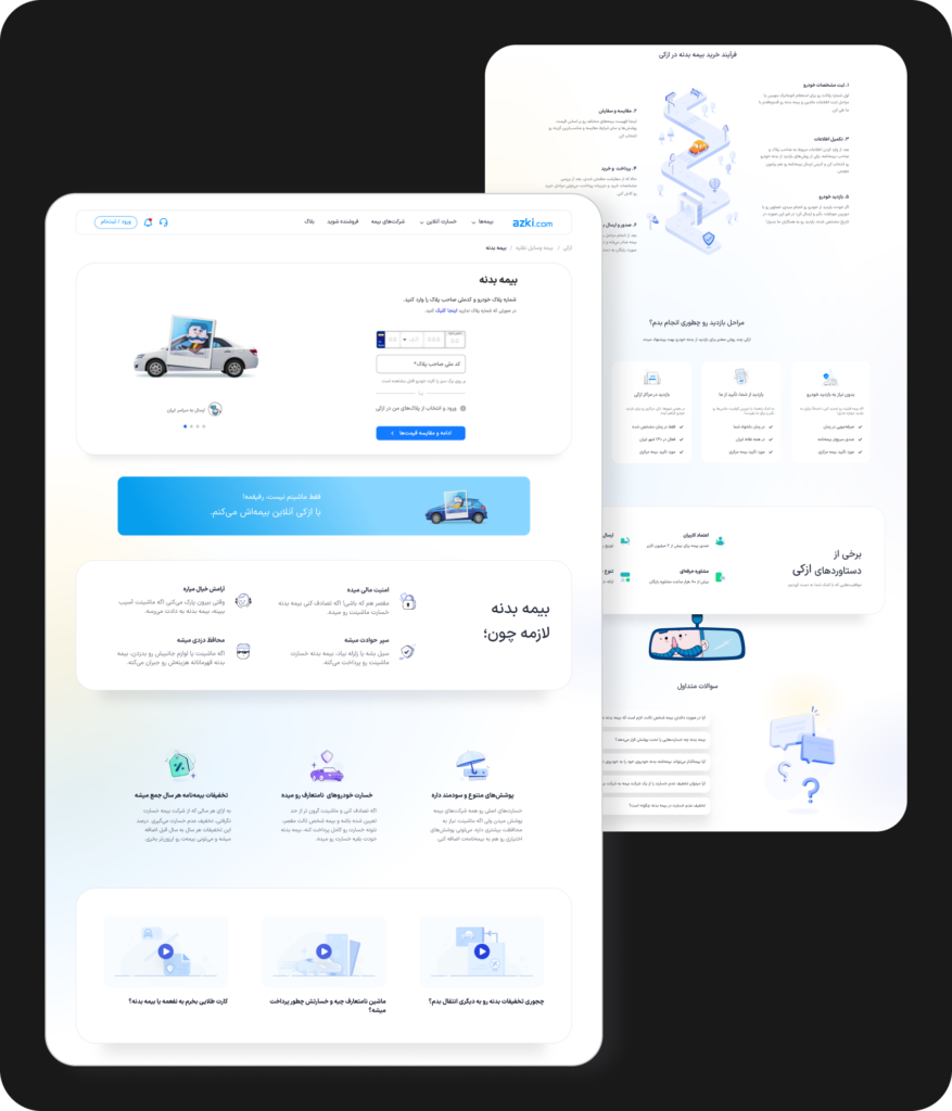
Final design
The final design was inspired by Azki design system,
Results
✅ The redesigned Car Insurance Landing page enhanced User Engagement and improve Time On Page from 40s to 60s.
✅ Scroll Depth Rate changed from 30% to 48%.
✅ Although we couldn’t precisely measure support logs, we observed a noticeable decrease in support questions related to information already present on the landing page.
Future plans
💪 The landing page is a work in progress.
Future plans include incorporating more animations to enhance user engagement and adding non-text content such as videos and GIFs to facilitate easier user education.
We also plan to link Azki blog page to this landing to achieve optimal and maximize user informing.